
One Easy Way to Test the Responsiveness of Your Website

A responsive website is one where the content of each page adjusts automatically to fit the device accessing the page. Ideally, the content is organized in a way that provides the best fit for as many different display types as possible. Some content, like side-by-side columns, can be stacked on smaller devices to make the content easy to read. Other content can take more time and consideration to accommodate multiple device sizes.
This post discusses one easy, and free, way to test the responsiveness of your website to best optimize the content.
One Easy Way to Test the Responsiveness of Your Website
First, it is important to understand why having a responsive website should be a priority. When smart phones first became popular, many companies created "mobile sites", which were a mobile friendly version of their original website. These sites were often secondary websites with slightly different content directed towards users with smaller screens.
One drawback to mobile sites was they often omitted important content that was on the standard site. From a technical perspective, it was also more challenging to keep the content in sync between the standard and mobile sites. Luckily, not long after mobile sites became common, responsive design usurped this model.
Responsive design is a more efficient solution because a website with all pages are created once. Each page can be optimized for different sized devices like widescreen monitors, tablets, and smart phones. This formatting happens within the page and does not require duplicate pages, etc.
Optimizing all pages of a website so they are responsive on different devices increases the score of the website with search engine optimization or SEO. Equally important, responsive design helps current and potential customers learn about your company and your products or services from the convenience of their devices the way you intended.
Responsive design tools are built into some 3rd-party apps, like Divi, which is a paid for app that works with WordPress sites. In the absence of a tool that can display a webpage at specific sizes so you can optimize each page and the content on it, there is a way to do this that is free. The easiest way to optimize for different sized screens for free, is to use the web developer tools built into web browsers.
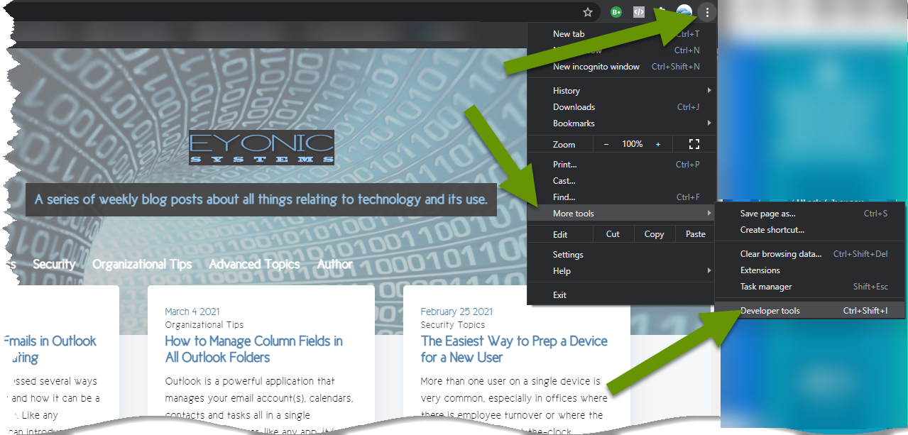
To access the web developer tools in Chrome:
- Click the 3-dot "Settings" menu in the upper right corner of a browser window.
- Click on "More tools" to open the sub-menu.
- Click on "Developer tools" to open the developer window.
To access the web developer tools in Firefox:
- Click on the 3-line "Settings" menu in the upper right corner.
- Click "Web Developer" at the bottom of the settings menu to open the sub-menu.
- Click on "Responsive Design Mode" in the sub-menu.

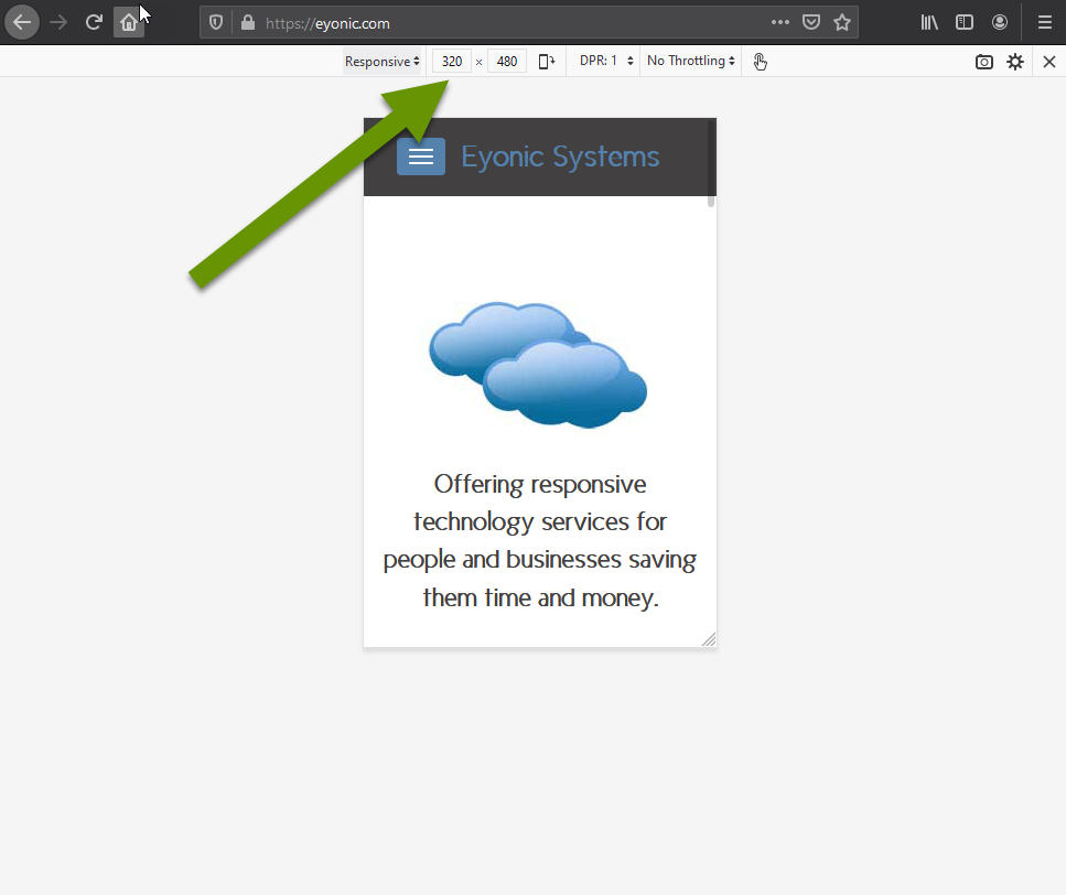
Once the developer tool is selected, the size of the webpage you had open will automatically resize inside the browser window to match the size of the first device in the responsive device list. In both browsers, the device sizing is listed at the top of the browser page, just below the URL bar. Below are examples of different devices in each browser.
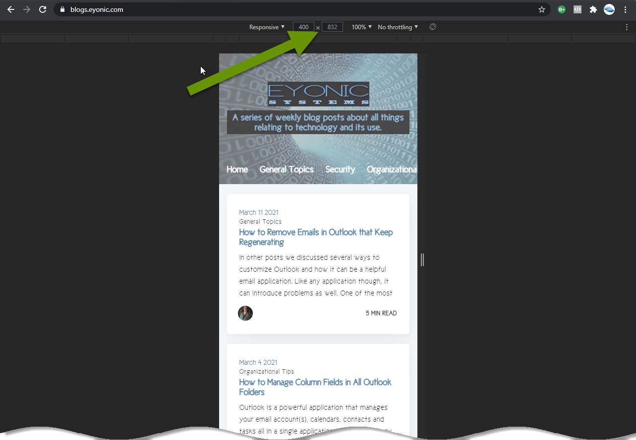
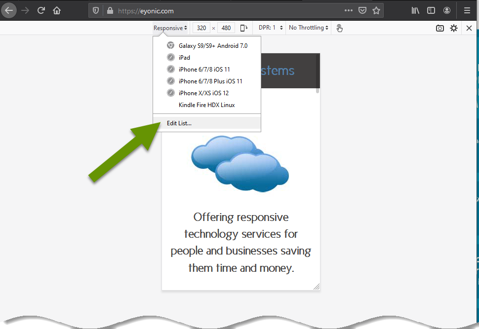
In both browsers, click the word "Responsive" with an arrow next to it to choose from other common devices. This will once again resize the webpage within the browser window.
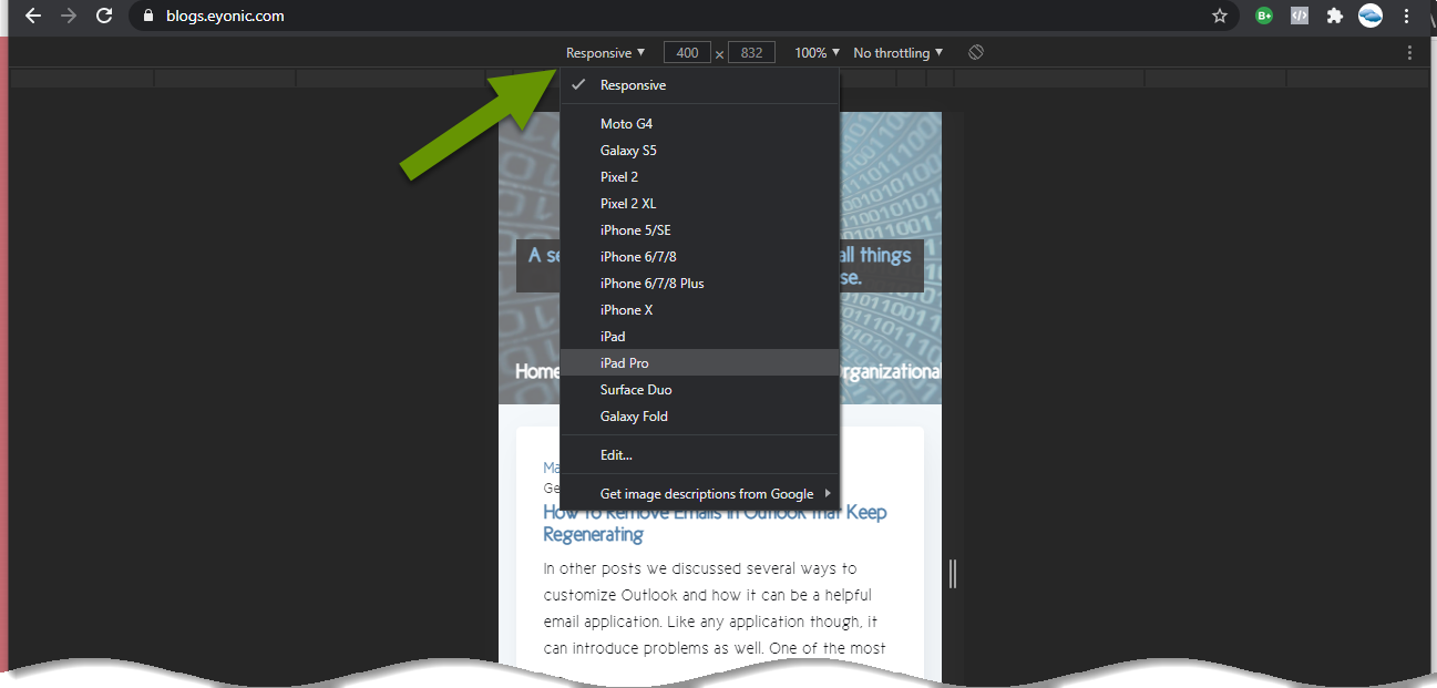
If desired, you can add or remove devices from the standard drop-down list at any time. In both browsers, click on "Responsive", then click on "Edit" or "Edit list" in Chrome and Firefox respectively.
From here, select the devices you want to add or remove from the drop-down list for quick access. Adding new devices helps you test how webpages display on those devices. Keeping older devices can ensure your site is backward compatible for any devices you still wish to support. Analytics about your website visitors are extremely beneficial in choosing devices to optimize for, as they tell you which devices are commonly visiting your site.
Once you have finished selecting or deselecting devices, simply close the device settings window to save the settings.
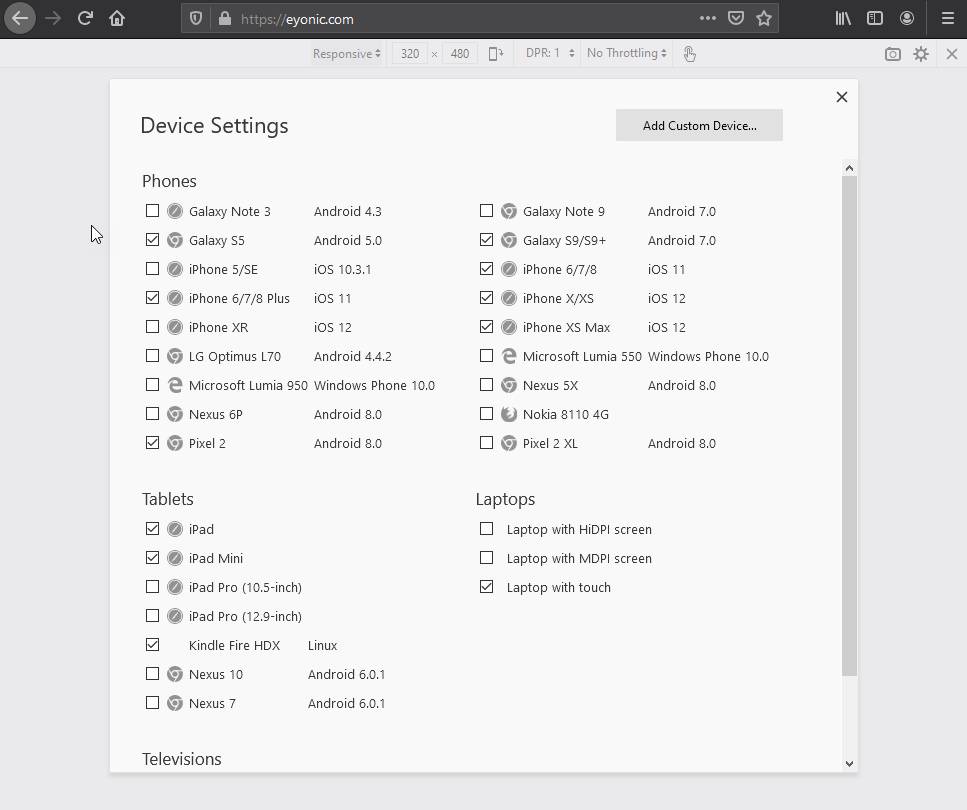
NOTE: You can also create custom sizing if necessary using the "Add custom device" button in both browsers.
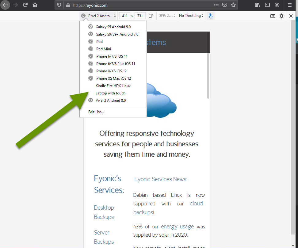
Now, the devices selected are available to choose from within the drop-down responsive menu.
Using the built-in web developer tools in Chrome or Firefox is the easiest way to optimize for responsive design in the absence of another tool. Having varying display sizes is extremely important when optimizing each page on your website. Website analytics are a great tool to help you determine which sizes should be a priority when working on responsive design.
As always, there is often a built-in or free tool that can help you make the most of your technology, you just need to know it exists and how to use it!