
How to Use Excel to Quickly Identify Data Patterns

Collecting data is only half of what it takes to accomplish anything with it. It is the important first step of course, but what you do after that is equally as important when working towards something. Most things in our lives have data attached to them - exercise tracking, grades, purchases, sales, expenses, retirement funds, travel mileage and expenses, the list could go on and on. However, what makes data useful is being able to identify patterns.
When attempting to find patterns manually, the process can feel overwhelming. Luckily, there is a way to quickly identify patterns in data if the data is entered in Excel. This post shows several ways to quickly identify patterns using a single type of data, but keep in mind, these will work on almost any kind of data.
How to Use Excel to Quickly Identify Data Patterns
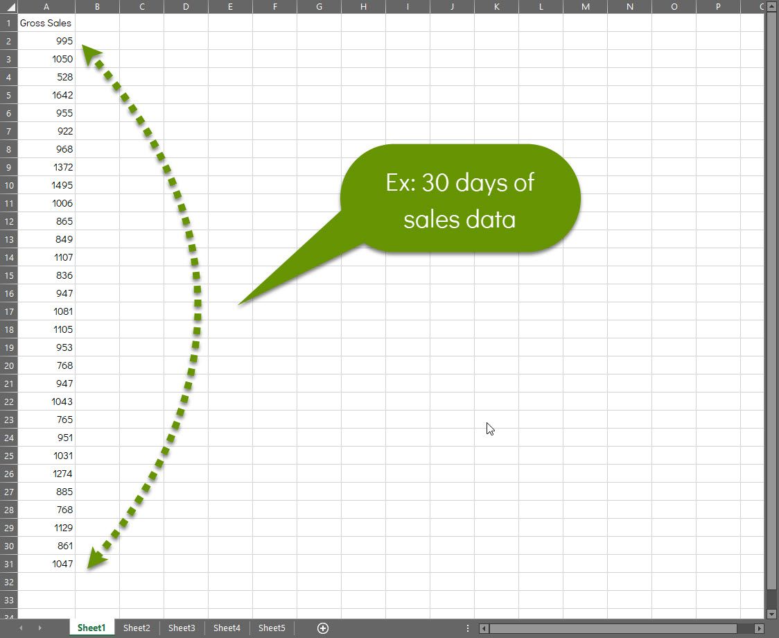
In the examples below, 30 days of "sales data" have been entered into Excel. These values could be replaced with almost any kind of data. Create a spreadsheet by entering data that makes sense to you and apply conditional formatting to identify data patterns the same way we have to get your own unique results.
Here's our sample data:
There are several ways to quickly identify and highlight different types of data patterns in Excel. Once the desired information is identified, you can look at what was different (good/bad) on those days. For example, in keeping with the sales example, on days where the values were best you may ask things like:
- Was there a special sale?
- Was a new product released?
- Was there a special event?
- Did a new marketing campaign roll out?
Contrarily, on those days where the values were lowest, you may ask:
- Were people out of town for a holiday?
- Was the previous or successive day a high value day?
- Statistically, how has that time of year done in the past?
- Did the day fall at the end of the month/pay period for most people?
Again, the data and questions can easily be made to coincide with the type of data you have. For instance, if you were tracking exercise, you could ask things like did I get enough sleep or push too hard the day before? The purpose of these questions is to find out what you can once the data patterns have been revealed.
How to quickly color code top/bottom/average values
From within Excel with a series of data entered:
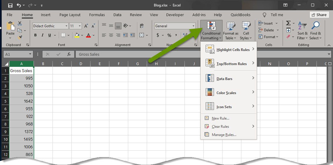
- Select the data to format.
- On the Home tab, click on "Conditional Formatting" to access the available formatting.
- Select "Top/Bottom Rules" to expand the menu.
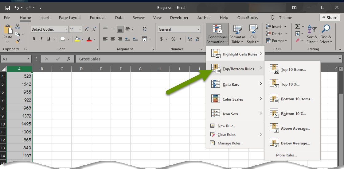
- Select the option from the pop-out menu that makes the most sense for your data and what you are trying to accomplish. In the sales example, the bottom 10% conditional formatting has been selected. NOTE: The amount of unique data cells you have will determine which of the top/bottom 10 items or top/bottom 10% is a narrower perspective. There will be times when a selected view does not give you the result you expected. If this happens, try a different formatting view to see if it provides better results.
- Once the formatting type has been selected, you will be prompted with a window that allows you to modify both the perentage or number, as well as the color that is applied. In our example we modified the percentage to show the bottom 20%.
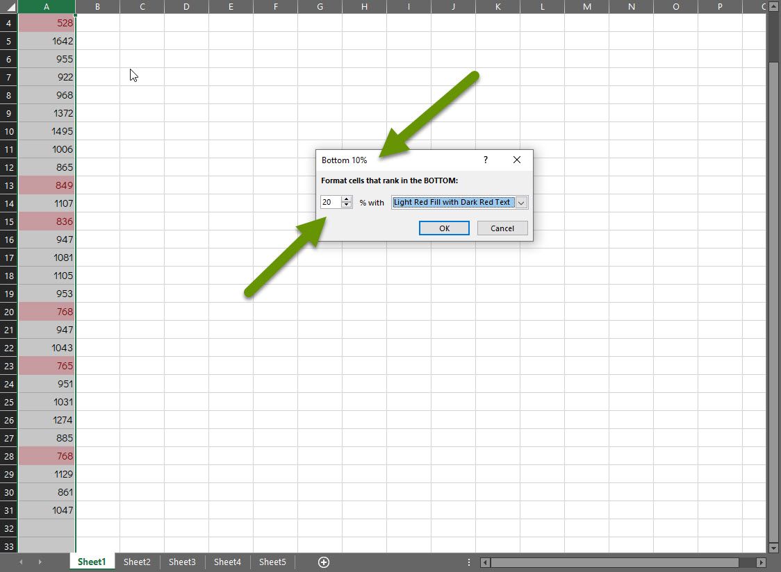
As you can see, the values that fell in the bottom 20% are highlighted. If desired, the formatting color could also have been changed in the pop-up box presented once we selected to apply the bottom 10% conditional formatting view.
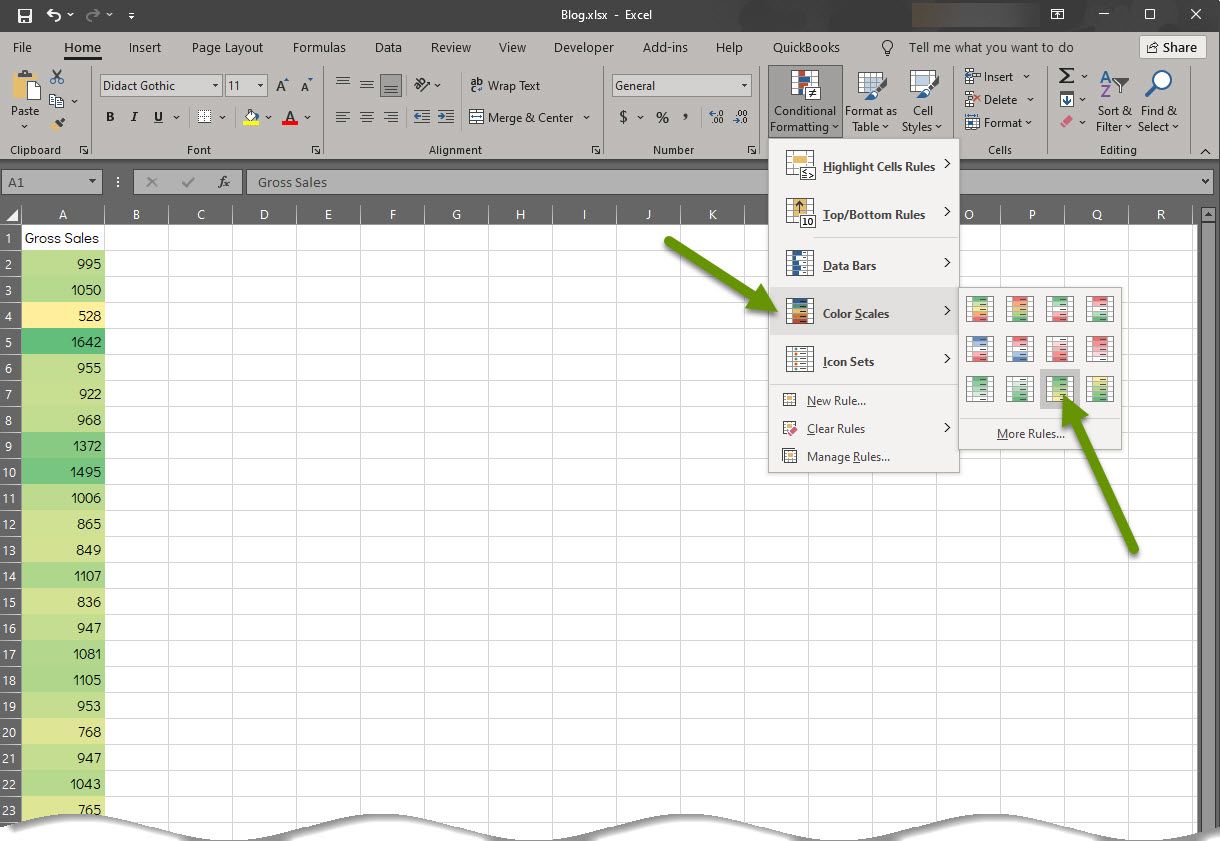
How to quickly color code all entries in a sliding color scale
From within Excel with a series of data entered:
- Select the data to format.
- On the Home tab, click on "Conditional Formatting" to access the available formatting.
- Select "Color Scales" from the menu.
- Hover over any of the options in the pop-out menu to see how they would apply to your data and read their descriptions.
- Select the option that makes the most sense for your data and what you are trying to accomplish.
As you can see in the image above, there are several different variations of color bars. This includes having variations where the highest or lowest numbers are highlighted in red because there are instances when both of those are situations that need to be addressed. Keep in mind when using color scales, all values will be filled with color.
How to quickly color code with data bars
From within Excel with a series of data entered:
- Select the data to format.
- On the Home tab, click on "Conditional Formatting" to access the available formatting.
- Select "Data Bars" from the menu.
- Hover over any of the options in the pop-out menu to see how they would apply to your data.
- Select the option that makes the most sense for your data and what you are trying to accomplish.
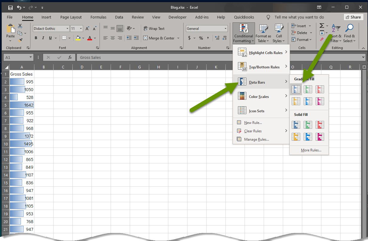
In this example we chose a blue gradient. Data bars are another formatting view that colors each value, like color scales. If you choose a solid color data bar, you may need to change the color of the font so the data is still easy to read.
How to quickly identify patterns using icon sets
If none of the conditional formatting above provides an easy way for you to see the data patterns, you might try applying an icon set. Icon sets are quite a bit different than the examples above, but like color scales and data bars, apply formatting to each value.
From within Excel with a series of data entered:
- Select the data to format.
- On the Home tab, click on "Conditional Formatting" to access the available formatting.
- Select "Icon Sets" from the menu.
- Hover over any of the options in the pop-out menu to see how they would apply to your data.
- Select the option that makes the most sense for your data and what you are trying to accomplish.
In this example we added a shape icon set that included a green checkmark, a yellow exclamation mark and a red X. These are quite unique and made it VERY easy to see which values were highest and which were lowest.
How to quickly identify very specific values or patterns
At times you may need to drill down into the data and identify very specific values. In cases like that, you might be better off creating a new conditional formatting rule to show the exact data you need rather than using one of the previously created rules. Creating new rules allows you to create rules like those demonstrated above, as well as rules allowing you to:
- Format only those cells that contain (most all the formulations like greater than/less than/between/etc.) "X".
- Format unique/duplicate values.
- Format cells when a specified formula is met.
To create a new formatting rule from within Excel with a series of data entered:
- Select the data to format.
- On the Home tab, click on "Conditional Formatting" to access the available formatting.
- Select "New Rule" from the bottom of the menu.
- Select the option that makes the most sense for your data and set all of the available parameters for what you are trying to accomplish.
- Choose a color for the formatting by clicking the "Format..." button and selecting a color.
- Click the "OK" button to apply the formatting rule.
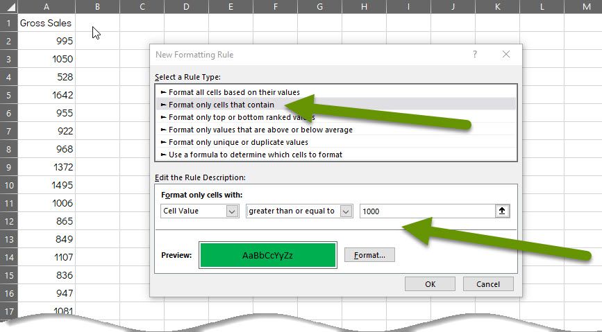
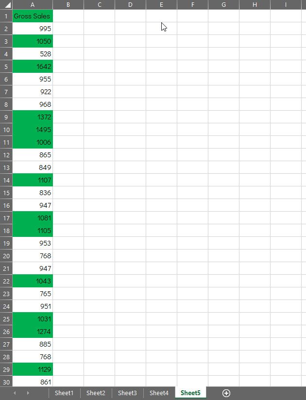
In the new rule above, any cells with values greater than or equal to 1,000 will be formatted in green. Here is what the data looks like once the rule is applied:
Conditional formatting is one of the quickest ways to identify data patterns, regardless of what types of values you have collected. The numbers above could represent almost any kind of data. Adding conditional formatting provides a quick way to dig into your data and find specific patterns that can help you ask the right questions which in turn will hopefully help you find how to be more successful with whatever the data represents.
As always, being able to process and appropriately respond to collected data in a timely manner makes the data more valuable!