
How to Quickly Add a Chart to Visually Compare Data in Excel - Part 1

In previous posts we have covered some of the many ways Excel can be used to help track data. These have included how to identify patterns like date-based patterns, separating text to columns, creating controlled drop-down menus in cells, filtering data, and much more! Excel is a powerful tool that almost anyone can find a way to use if they understand its features and how to use and modify them.
This post discusses another way Excel can format data to find trends more easily: by creating charts that visually represent the data.
How to Quickly Add a Chart to Visually Compare Data in Excel - Part 1
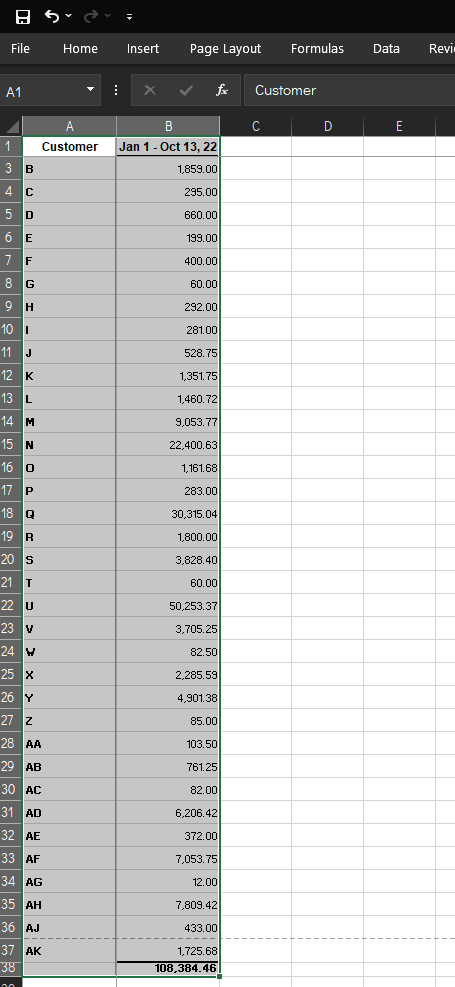
In this example, we will show how to create a chart that compares the income from customers over a year. Keep in mind this data could be just about anything, this is a simple visual so you can get an idea how charts work.
To quickly add a chart to visually compare data in Excel:
- First, unless you already have some data you want to work with, create a spreadsheet with some dummy data to practice with. Once you are more comfortable with how charts work, you will be more prepared to enter data into Excel in a way that a chart can easily handle.
- Highlight the data you want to use to create a chart. This can be done by left-clicking on the first cell and holding the mouse key while dragging the mouse to the last cell you want to include.
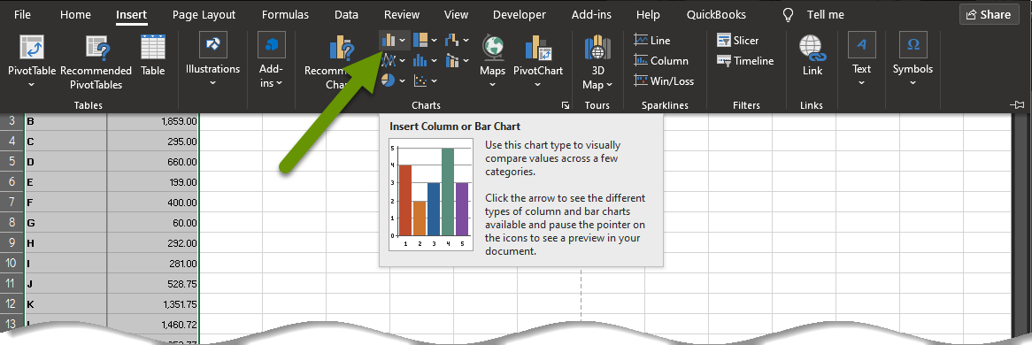
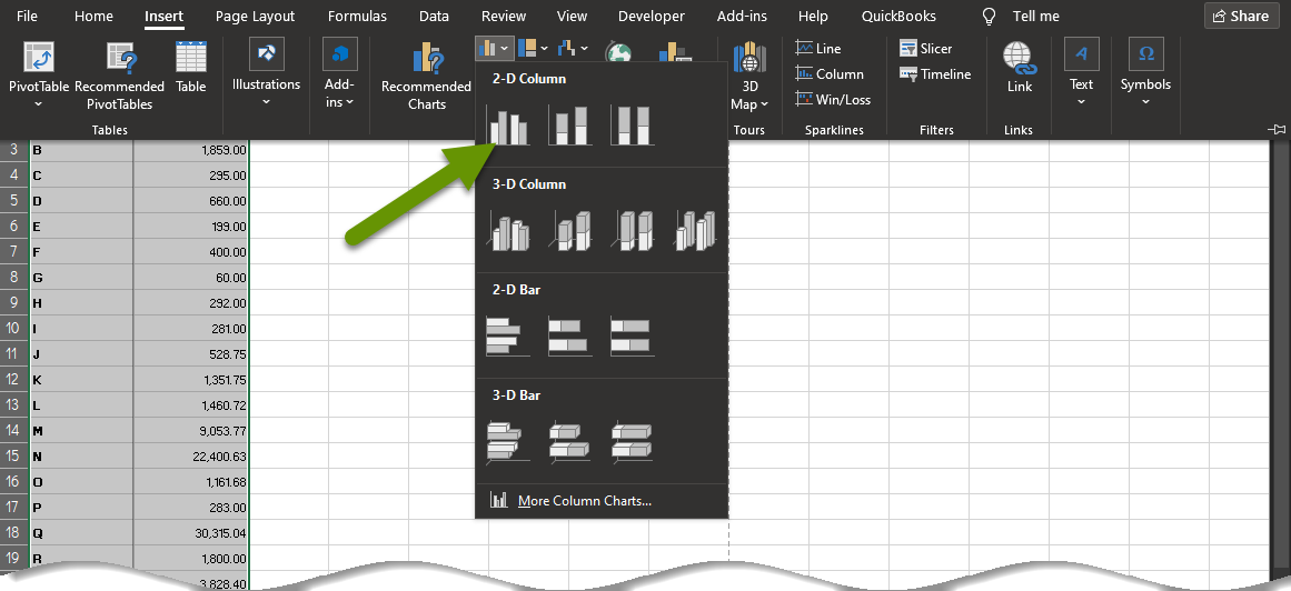
- Click on the "Insert" tab and select from the types of charts available. If you are unsure of the type of chart to use, click on "Recommended charts". In this example, because the data lends itself to a column or bar chart, we will click on the image of a column chart and select a 2-D column chart from the drop down list.
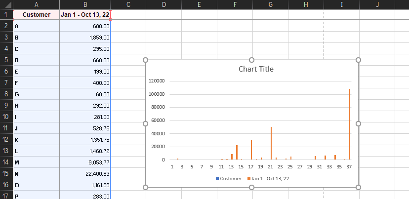
- The chart will immediately be created within the same sheet as your data.
Modifying the chart to better represent your data
There are tons of ways to adjust a chart. This post discusses some of the items that affect the actual data and its values, while part two will discuss the aesthetics of how the data appears.
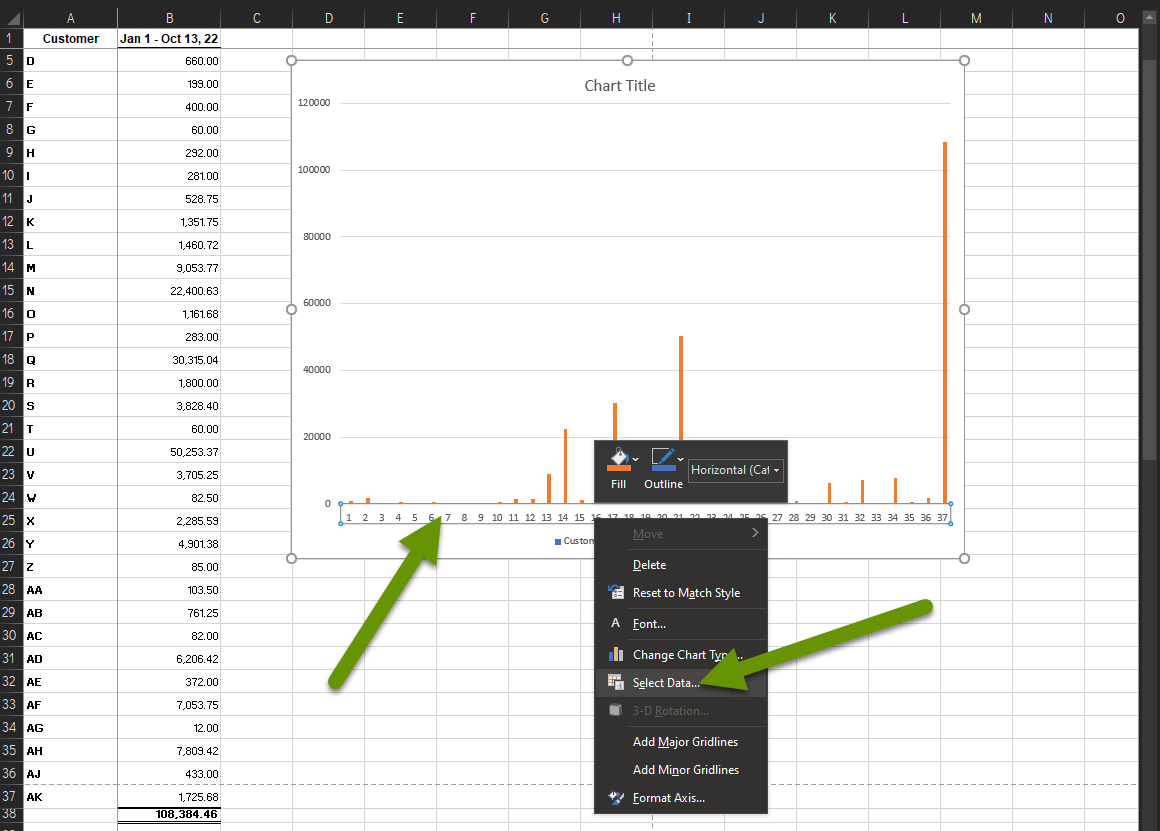
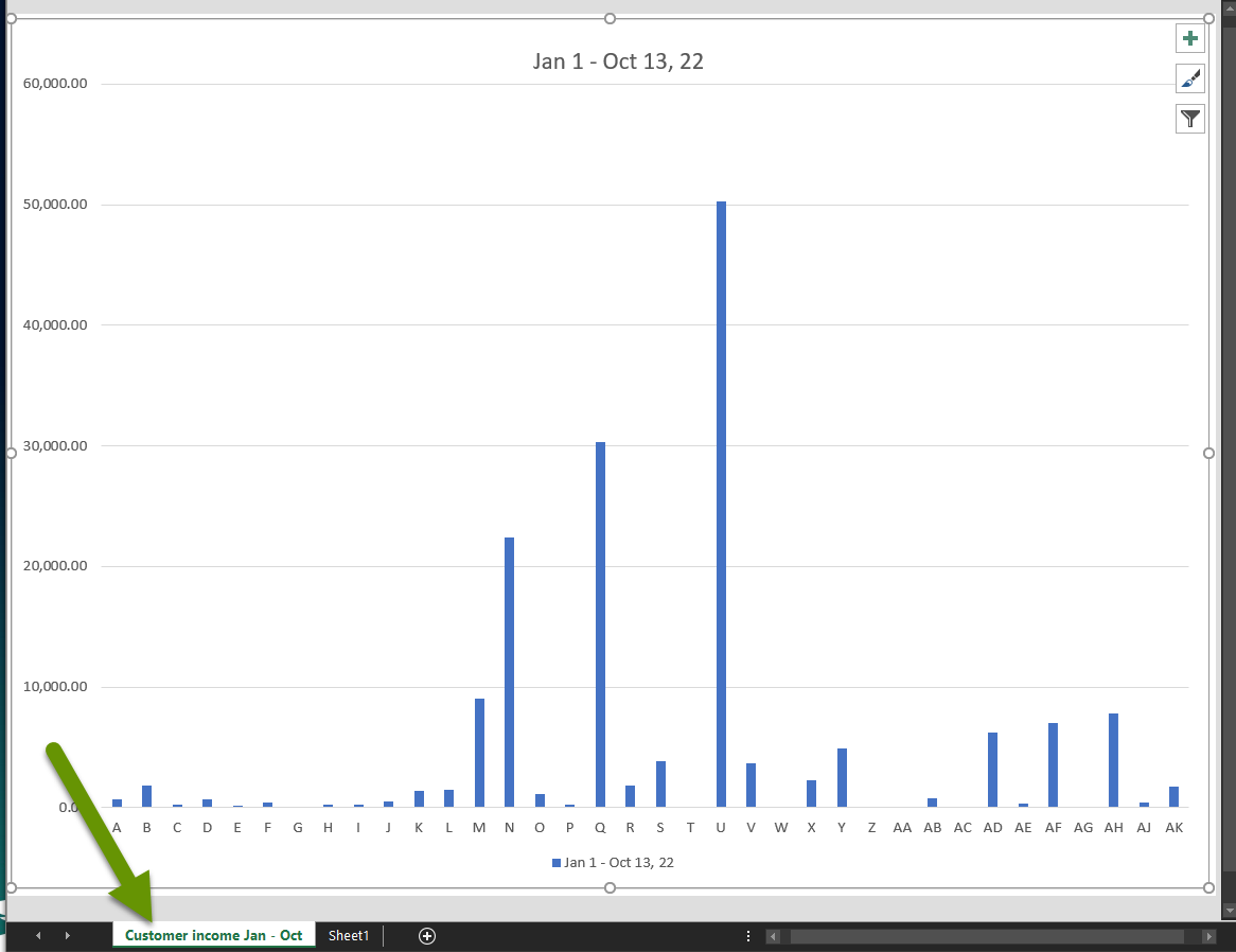
As you can see in the example above, there are some things about the newly created chart that are less than ideal. For example:
- The horizontal axis has listed the entries as numbers rather than using the names in the customer column.
- The chart was created directly within the sheet rather than on a new sheet all by itself.
- The data is skewed because the last entry is not a customer, but rather a sum of all the customers which does not make sense for our purposes.
To fix the labels of an axis:
- Right-click on the axis labels you want to change and choose "Select Data...". NOTE: Be sure only the axis labels are selected, otherwise you may get different menu options.
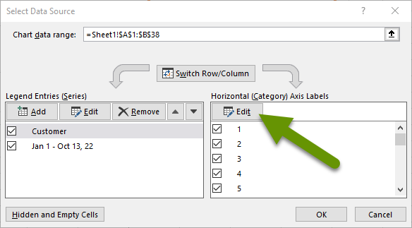
- In the "Select Data Source" box, click on the "Edit" button on the right side above the axis labels.
- The Axis Labels box will appear.
- Select the range of cells in the spreadsheet that have the correct labels.
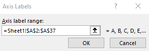
- Click OK to save the labels.
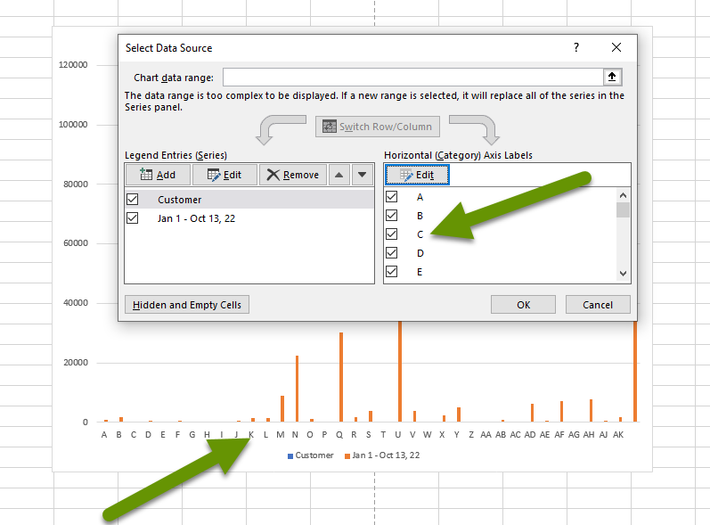
- With the correct labels selected, the label names will appear in the list of axis labels below the edit button in addition to the chart.
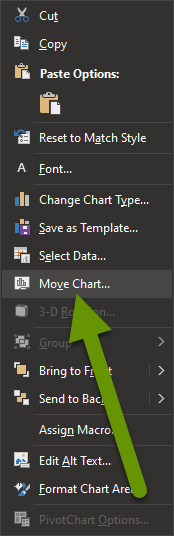
To update where the chart is located:
- Right-click on the middle of the chart - but not on a data point or label - to select the entire chart. This is probably easiest at the top of the chart. Select "Move Chart..." from the pop-up menu.
- The menu looks like this:
- In the Move Chart box, click the radio button to either move the chart to a new sheet or move it into a sheet that already exists. To move it to an existing sheet, click the drop down and select an existing sheet.
- If you are moving the chart to a new sheet, you can name the new sheet at the same time by clicking in the box next to "New sheet:" and typing a name.
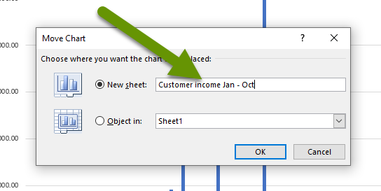
- Click "OK" to save the sheet in its new location.
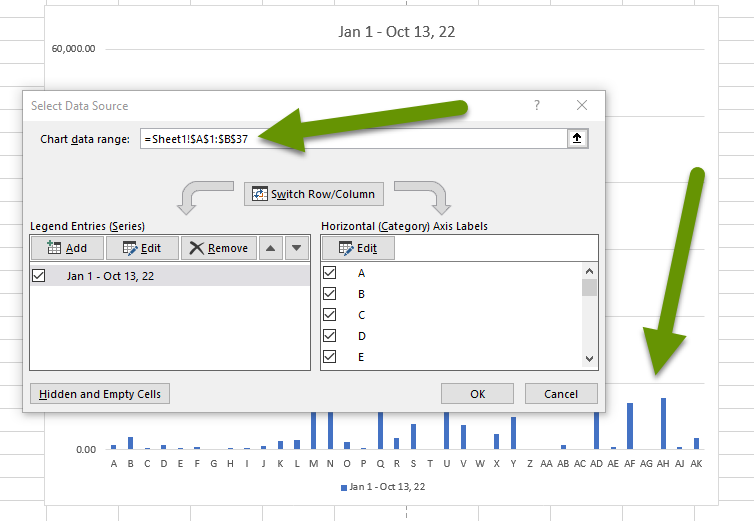
To update the data range selected and add or remove cells:
- Right-click on the chart and choose "Select Data".
- Click in the box at the top next to "Chart data range".
- Re-select the range of data in the spreadsheet to include in the chart. This will enter the data in the proper format in the box.
Charts can provide great visual representations of data which make it easier to find trends, notice issues, and track any data that is important to you. Inserting a chart is quick and easy, but there can be some work required to get the chart to best represent your needs. Luckily, data labels, the location of the chart, and the data range selected, can all be modified at any time to better represent the data. In our next post we show how to take charts another step by adding and formatting labels and more in the chart.
As always, knowing the best way to configure and represent data is well worth the time!