
How to Quickly Add a Chart to Visually Compare Data in Excel - Part 2

In the first post showing how to quickly add a chart in Excel, we demonstrated how easy it is to create a chart that visually represents data for easy comparison. This post included creating a bar chart, modifying the data included, changing the labels on an axis and moving the chart to a new location.
This post continues the topic of creating a chart by showing how to modify different visual aspects of the chart so the data is easier to understand and identify.
How to Quickly Add a Chart to Visually Compare Data in Excel - Part 2
Nearly every part of a chart can be modified to change its appearance. The information below shows how to change many of the most common elements. These are elements that are auto-generated when the chart is created and often will work fine, but it is also nice to be able to change them to better represent your information.
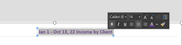
To change the title:
- Right-click on the title and select "Edit text" or double-click on the text in the box.
- Edit the text to represent the title you want.
To change simple aspects of the title appearance:
- Highlight the title text and use the tools in the pop-up box to change the font, font color, font styling, alignment and more.
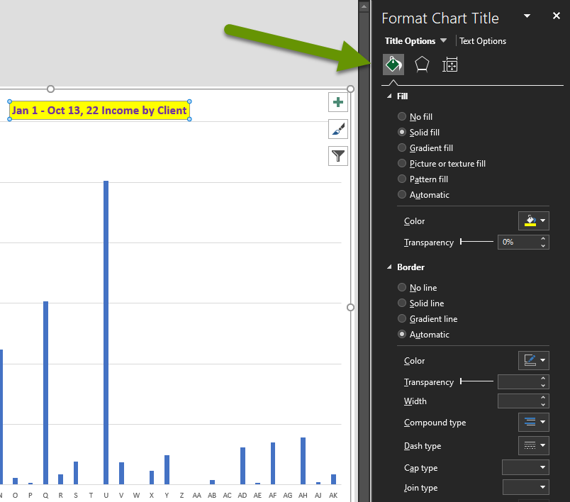
To make more complex styling changes to the title:
- Right-click on the title and select "Format Chart Title". There are three tabs available to modify the settings of the title. The options are: Fill & Line (paint can), Effects (pentagon), and Size & Properties (square).
- On the Fill & Line tab you can add background colors and borders.
- On the Effects tab you can change the look and feel of the font by adding a shadow or glow, changing the edges of the box, and adding 3-D formatting.
- On the Size & Properties tab you can change the alignment and text direction of the title box.
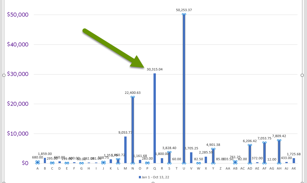
To change the colors of the bars used to represent the data:
- Click on the axis below the bars then click on one of the bars. This should select all of the bars at once.
- Right-click on any selected bar and click the Fill button.
- Select any color from the drop-down menu.
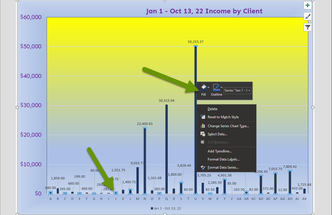
The bars will display the new color all at once.
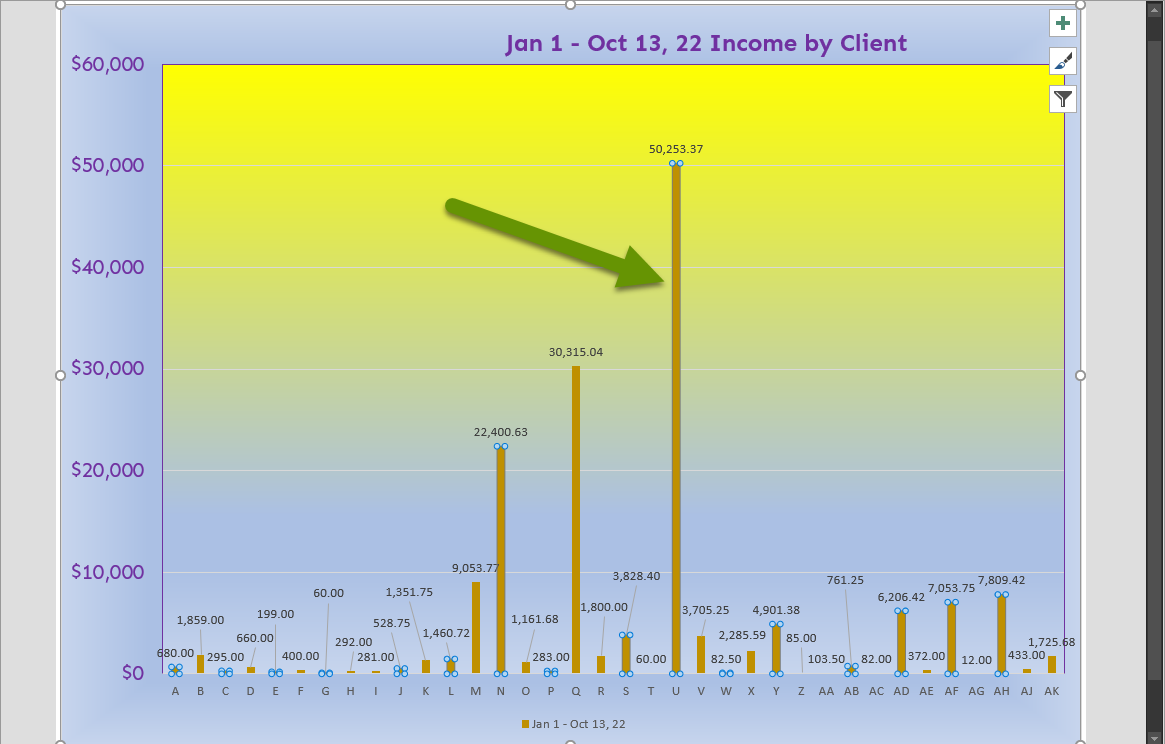
In addition to changing the color of all the bars at once, you can make each bar a different color. In this example, we changed the color of all bars because they represent the same data type, sales by customer, so changing them all makes sense. If you want to change each bar independently, simply click and make sure only one bar is selected before changing the color.
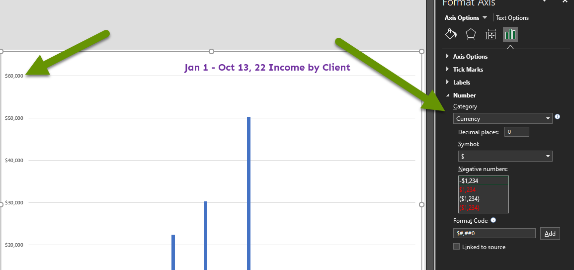
To change the values of an axis:
- Right-click on the axis you want to change and select "Format Axis" in the pop-up menu.
- In the Format Axis window, click on the bar chart icon.
- Expand the Number section and change the category of number if it is not correct. In our example, we needed to change the category from general to currency.
- In the Decimal places box, change the two to a zero.
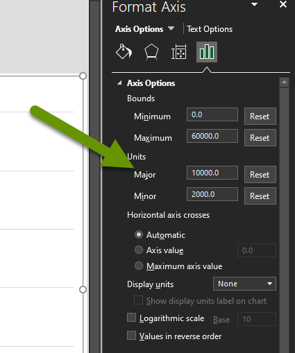
To change the difference between each value on an axis:
- Right-click on the axis and select "Format Axis".
- Modify the numbers in the Units box for Major or Minor values under the Axis Options heading listed on the bar chart tab.
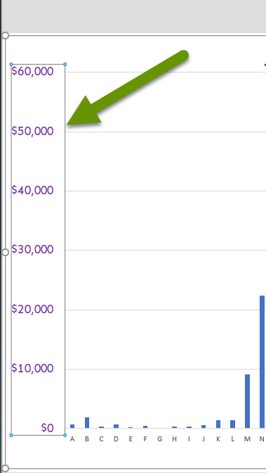
To modify the labels of an axis:
- Right-click on the labels of an axis and select "Font".
- In the Font properties box, change the font type, size, and more.
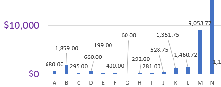
To add labels to the data represented in the bar chart:
- Right-click on one of the data values represented in the chart and click to expand "Add Data Labels".
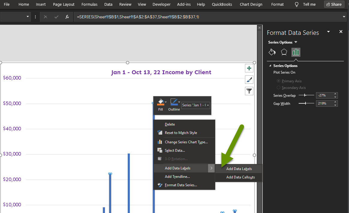
- Select "Add Data Labels" from the menu.
As you can see, the labels overlap because they are too close in my example. This often happens, but luckily you can move the labels so they are easier to read. Simply click on a label and drag it to a better location. When you move the label, a line is created to point to the bar it represents so you will always know what that value represents.
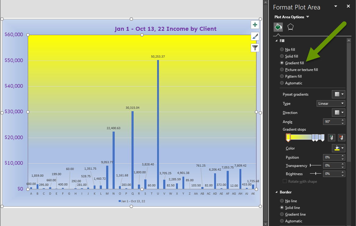
To format the background of the chart area:
- Right-click in the middle of the chart area and select "Format Plot Area".
- There are three tabs to choose from here, just like when formatting the chart title.
- The Fill & Line tab allows you to fill the charted area with patterns, gradients and more. Expand the Fill section on the Fill & Line tab and select whichever options you prefer.
The examples above demonstrate some of the formatting options available with a chart and how to access them. Aesthetic changes can be done at any time and most items are simple to modify. Optimizing the formatting can be important in drawing attention to the right places and ensuring the information is easy to read.
As always, knowing how to modify information to best meet your needs makes it worth the time it takes to track and organize data.