5 Things you Need to Understand Before Building Any Website
Websites are a great way to showcase a business, hobby or craft. They can include videos, images, testimonials, interactive data, forms, contact and location information, calls to action, and of course, important information about what makes you unique. In other words, why you do what you do and why others should be involved with you.
This post is part one of two that discusses five things everyone needs to understand before building any website. This week's post covers icon images, optimizing for mobile screens and object placement. Next week we will cover some SEO basics and image licensing.
5 Things you Need to Understand Before Building Any Website
This is not an exhaustive list of the things everyone should understand before building a website, but rather covers things you might not think of when writing content, gathering images and planning.
1. Browser icon images
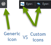
A browser icon image is the very small image that shows up in the web page tab of a browser to the left of the page title. While this might sound like a silly thing to list as important, these icons do matter. For one thing, these icons get users more comfortable with your logo. Secondly, as users become familiar with your logo, users will use the icon to identify an open page on your website as they bounce between pages in a browser.

Let's be honest, most users open a browser and end up with several pages open at a time. Some they will look at that day and others they might not get back to for a week. Either way, if you have a defined icon, they will be able to quickly find your site again. When a website does not have this icon image defined, it will end up with a default image, often times the WordPress icon. But defined icons help users get back to your site when they have opened several tabs and:
- They want to be sure to go back to a page to take a specific action - like signing up for a service or ordering a product.
- The page has information they either did not have time to finish reading, want to share with others, or simply want to read again.
- They visit the page(s) regularly and it is easier to just leave them open all the time.
- They are a trigger to remind them to do something. This could be a social media site, their own website, or something else entirely.
When you set a custom icon image, anyone who visits your website can easily relocate it among their browser tabs using the icon. Keep in mind, it is much easier for users to identify the icon representing your website when the image ties in with your business logo/theme in a logical way. In other words, if you sell boats, a boat, wave or similar image would be far more effective than a tree, dog or the default image.
2. Optimize for mobile devices
No matter what information you want to portray on your website, or what service or items you are selling, it is critical that you find a way to format it that makes for a nice user experience even when they are accessing it from a small screen. Many users will visit your website for the first time from a mobile device. This could be because they had an idea, did a search and found your site, clicked or heard an ad, or some other reason.
Whatever the reason, if they have a bad experience when they visit your site on a small screen, they will be less likely to come back later regardless of the device size. On the other hand, when someone visits your website and has a good experience, they are more likely to visit the site again, possibly to purchase something. Making sure they have a good experience, regardless of device size, is imperative to success.
Second, and while everything shouldn't be done from the perspective of search engine optimization (SEO), optimizing your site for mobile devices does in fact impact the overall SEO score. Building a site that is user friendly, has great content, and is rated well for search engine optimization is not easy, but it is important to find a balance.
3. Object placement
Another important thing to consider when designing your website is to be sure to leave enough room between different elements. This ensures that each section can easily be navigated by users. Some things to avoid having are:
- Images too close together/overlapping or too close to text.
- Several links and/or buttons that are really close together. NOTE: Links that are too close together can be hard for people with dexterity issues or shaky hands to touch and get the right link. Frustration caused from the inability to click on the right link could cost you visitors.
- A font that is too small or whose lines are too close together when sentences wrap. If the font on your website is too small users may be forced to continually zoom in and out. This is likely to lead them to abandon your site!

Not only is it important to make good decisions about object placement to increase the usability of your website, but once again, this will play a part in the SEO score of your website.
There are so many things to consider when building a website: the content, making sure you include call to actions so visitors know what you want them to do, telling your unique story, providing valuable content, and much more. What you might not realize is that there are also many other things to consider like: having an icon image related to your business so users quickly identify your business in their browser tabs, optimizing for mobile users and making sure objects, links and content are far enough apart that users can easily navigate the site.
Next week we will continue this topic and discuss image usage and some basic ways to increase SEO.
As always, planning ahead will provide a better user experience and naturally increase the usability of your website.

