
3 Things You Can do to Better Organize Data in Excel Pivot Tables

When you have large amounts of data in an excel spreadsheet, inserting a pivot table is a great way to see the data from a macro level. The purpose of a pivot table is to take any amount of data, no matter how large, and summarize it into an at-a-glance view that can present the data in many different ways. A few things a pivot table allows you to control are which data is sorted into columns and rows, as well as if figures are counted, summed or something else entirely.
This post shows three things you can do to customize the data in an Excel pivot table which may help better represent the data.
3 Things You Can do to Better Organize Data in Excel Pivot Tables
This post demonstrates three easy ways you can better present the data in a pivot table that you might not know about.
Consolidating dates
One thing you may notice when you pivot data and add the date as a field for either rows or columns is that the date may not appear the way you want it to. One problem you may run into is having every date show up rather than dates automatically consolidating into months, quarters or years. The second issue you may find is having the months show up with a plus sign next to them.
The information below shows how to fix both of these issues:
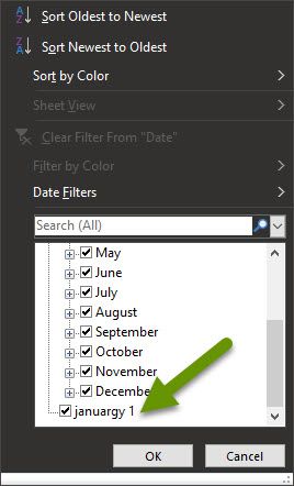
If every date in the data set shows up, there is most likely an issue with at least one entry in your date field. The easiest way to find and fix this is to go to the sheet with all of the data to find and fix the incorrect value.
- On the sheet with all of the data, click on the Data tab and click on Filter to enable filters.
- Click on the filter for the date field and look for an entry that is not an actual date.
- Click the check box next to "Select All" to deselect all items.
- Click the box(es) next to the bad data so only that information appears.
- Fix the data and then remove the filter.
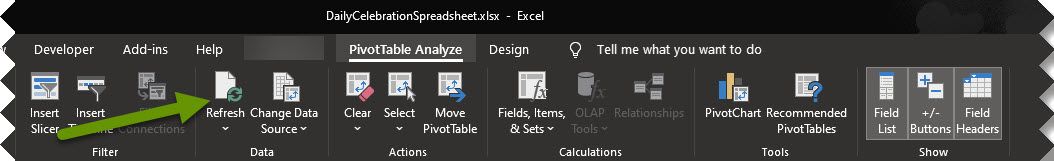
- Once the incorrect data has been corrected, go back to the tab with the pivot table and click to refresh all data.
- If the date field does not automatically adjust, remove the field and add it back as a field in the pivot table.
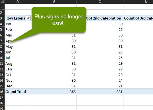
The other date issue you may come across is having the months show up with a plus next to them, which is not aesthetically pleasing.
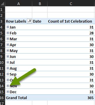
- To get rid of the plus next to the months, remove the date field from the pivot table, making sure to leave the "Months" field. NOTE: Your date field may be years or some other measure, be sure to leave the field that makes sense for your data.
- To remove the data field, click on it in the pivot table and select "Remote field" in the pop-up.
NOTE: Your date field may be called something different than "Date". Remove whatever field you used that represents the date.
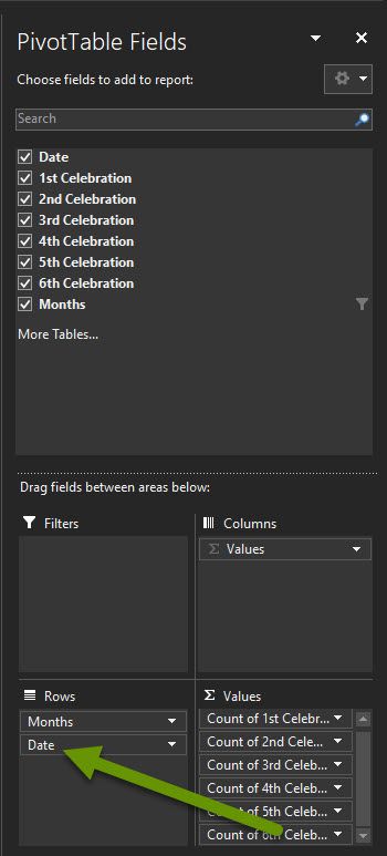
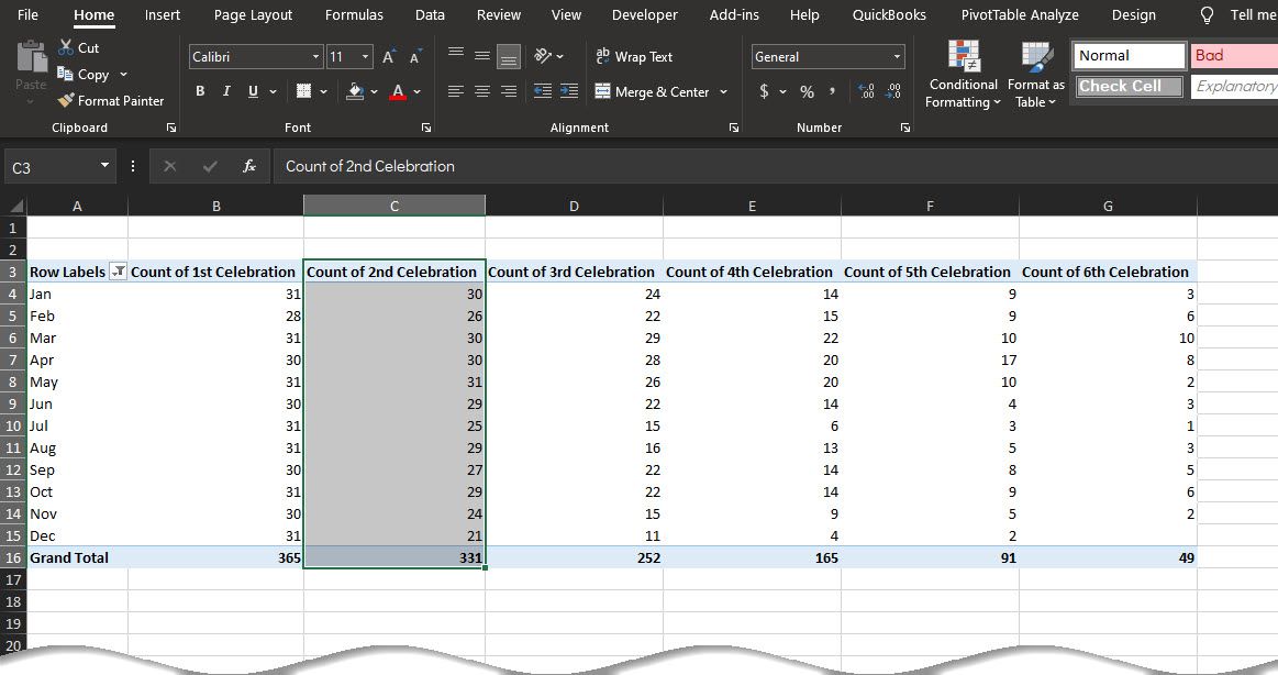
Reordering rows and columns
Depending upon what kind of data you have in your pivot table, you may want to reorder the data in the rows or columns. For example, say you opened a new business in August, and you have a year's worth of data, you might want the months in order beginning in August, which is not typically how the data will be represented in the table.
Luckily, you can easily move this data without breaking the pivot table. Keep in mind, a simple copy and paste will paste the data, but it will not remain a part of the pivot table so the numbers will not automatically update if the data changes. This is why you want to move a column or row to the proper location.
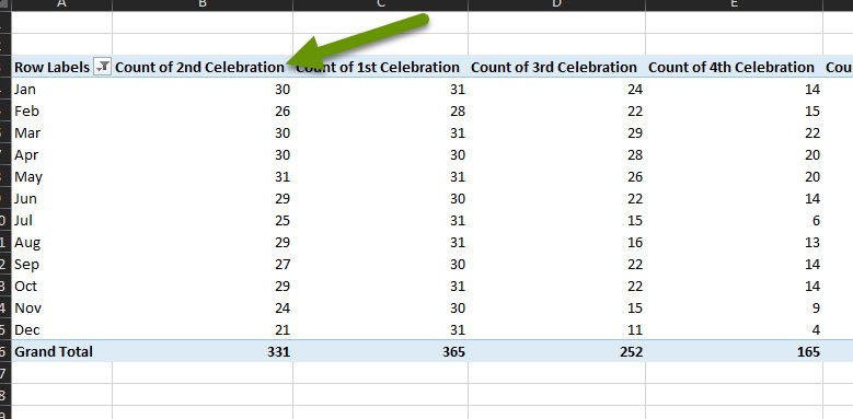
- In the pivot table, hover over the row or column you want to move until you get a small arrow pointing down towards the data. You will need to hover over the title of the row or column, not the data in the row or column.
- Once you get the arrow, click on the row or column which will select all the data in that row or column.
- With the row or column selected, move the mouse up from where you have the arrow pointing at the data, until it becomes the four-headed arrow that allows you to move the data.
- Drag the data left/right for a column or up/down for a row. You will notice that a line will develop between the existing data to let you know where the data will end up once you release the mouse.
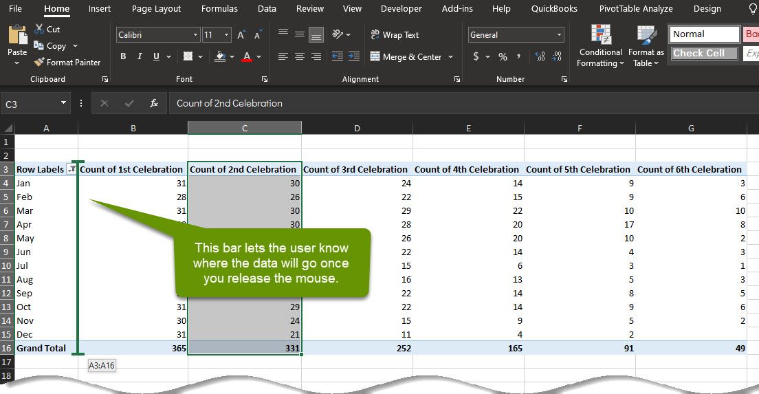
- Once the bar appears where you want to move the data, release the mouse and the data will be moved to its new location.
Updating the labels in the pivot table
In a pivot table, the names of the columns are created automatically using the names relative to the data from the original sheet. If you have ever tried clicking on the cell holding the name of a column, you may have noticed that you cannot easily click in the cell to change the name. Luckily, there are two ways you can change the label so it is more representative of the data.
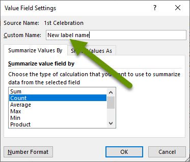
- Double-click on the cell with the label which will open the "Value Field Settings pop-up". Enter a new label into the box next to "Custom Name:". After you have entered the new label, click "OK" to close the window.
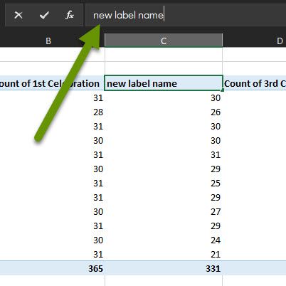
- Click on the cell in Excel, then click on the bar above the sheet where you would enter a function, etc. Type a new name for the label and press "Enter" to save the new label name.
Pivot tables are a great way to get a macro-centric view of all kinds of data. However, sometimes they are not the easiest for others to understand, or to manipulate, as there are many items that are created automatically. Fixing date issues, reordering columns and renaming data labels can help make the data more readable.
As always, knowing how to make the customizations you need is key in presenting the best possible data.